on
How to show the “Last 6 months” in a line chart with Google Data Studio.
When working with Google Data Studio client regularly asked me to display line chart showing data for the last six months. Even if the request seems pretty reasonable, it is not so easy to answer it. However there is nothing impossible with the help of a google spreadsheet and some formula.
The problem with showing the last 6 months data in Google Data Studio
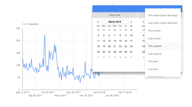
Looking at the built-in date range selector in Google Data Studio you have everything… last 14 days, last 30 days, this quarter, last quarter, This years, last years, yesterday, last month, this week, last week… but nothing like last 6 months or even last 3 months…
[caption id=“attachment_582” align=“aligncenter” width=“633”] Date range selector - Google Data Studio[/caption]
You can always select a specific date range manually or applying a filter to exclude and/or include a particular period but this process can’t be automated and will need to be updated every day.
How to create a last 6 months custom dimension
To solve this issue, we will have to create custom dimension directly integrated into our data set. In the case of Google Analytics for example, it means that we won’t use the direct connection between Google Analytics and Google Data Studio but an indirect connection with Google Sheet as an intermediate. Concretely we will import Google Analytics data into a Google Spreadsheet (using the free Google Analytics Add-On or Supermetrics). Then we will use this spreadsheet as our primary source.
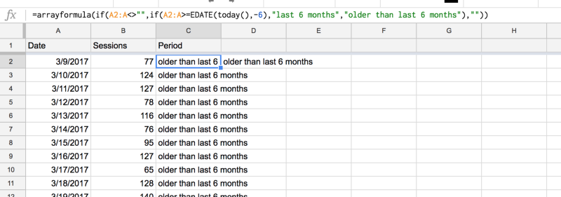
Let say we have imported Google Analytics date and sessions in a Google Spreadsheet using the free Google Analytics Add-On. We have two columns : a date columns and a sessions column. We will add to our data set a new column named “Period” using the following formula :
[caption id=“attachment_583” align=“aligncenter” width=“656”] GA data (metrics : sessions, dimension : date) imported using Google Analytics Add-On or Supermetrics[/caption]
Let’s break down this formula :
- _Arrayformula_ is just here to help us expand our formula automatically for all the rows in our spreadsheet. (more about it here)
- EDATE(today(),-6) give us today’s date minus 6 months.
- _if_ statement allows us to compare the today’s date minus 6 months with the date value on column A.
The result
Depending on the result of the if statement each row of data will be placed in two distinct buckets: last 6 months or older than the last 6 months. Since our formula is based on today’s date comparison, the last 6 months date range period will always be automatically updated every time our data set is being refreshed. When adding our Google Spreadsheet as a new source in Google Data Studio we now have access to our new custom dimension:
[caption id=“attachment_594” align=“aligncenter” width=“639”] Data Source - Google Data Studio[/caption]
You can easily use this new dimension to build a table (and incidentally make sure our calculation are correct) :
[caption id=“attachment_595” align=“aligncenter” width=“492”] Last 6 months custom dimension - Google Data Studio[/caption]
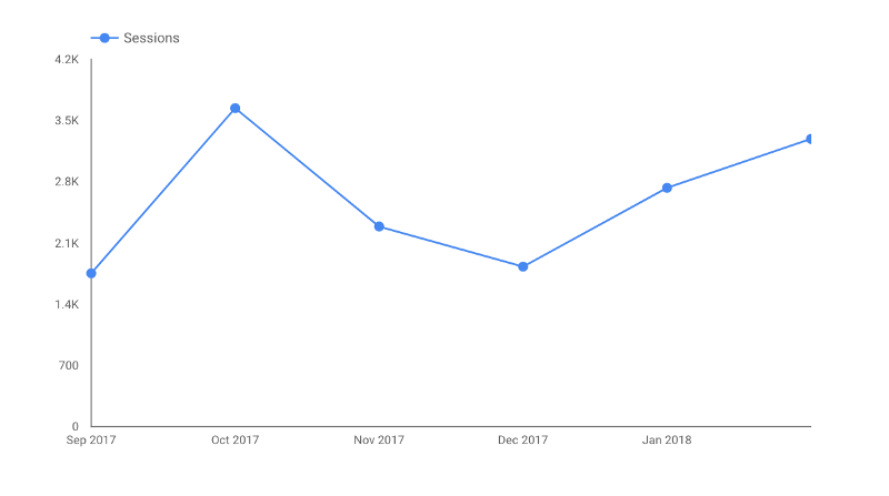
or finally creating our line chart showing the last 6 months of data:
[caption id=“attachment_596” align=“aligncenter” width=“467”] Last 6 months line chart in Google Data Studio[/caption]
If you have a question about this article please use the comment section below (and please especially if you found a better method !). If you need help with Google Data Studio, you can reach me directly using the following form :