on
How to create a bar chart in Google Data Studio without dimensions… the case of Google Analytics Goals.
Google Data Studio is a great tool however some limitation can be incredibly frustrating. Things can get quickly complicated even for what it seems to be a most straightforward, apparent request.
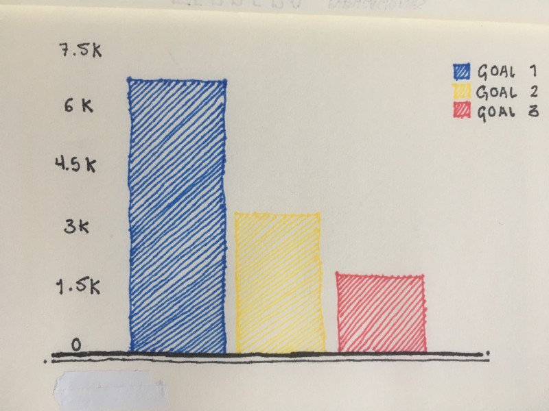
I recently found myself in a situation where a client wanted to have Google Analytics goals displayed in a simple bar chart using Google Data Studio. My client wanted something like this :
[caption id=“attachment_571” align=“alignnone” width=“420”] Expected visualization (Bar Chart + Google Analytics goals)[/caption]
Easy right?
The problem with Google Data Studio when building a bar chart with Google Analytics goals.
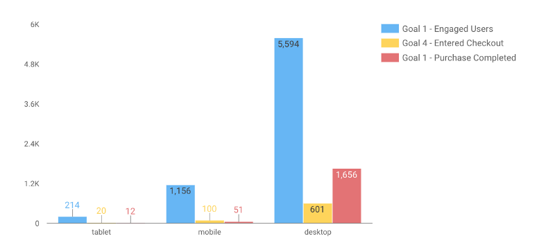
Google Data Studio doesn’t let you create a bar chart without applying at least one dimension. Why is this a problem? Because in Google Data Studio, a Google Analytics Goal is a metric, not a dimension. Therefore if you are trying to visualise your Google Analytics Goal with a bar chart, you will probably end up with something like this :
[caption id=“attachment_572” align=“alignnone” width=“569”] Goals bar chart with device category as a dimension[/caption]
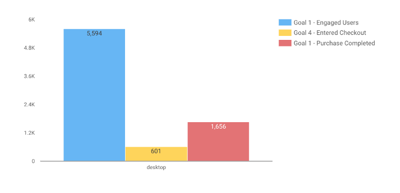
In this example, I’ve applied the “device category” dimension to our bar chart. It’s pretty unreadable. We could simplify this bar chart by applying a filter on the “device category” dimension. By filtering tablet and mobile devices, we have the following result :
[caption id=“attachment_573” align=“alignnone” width=“800”] Goals bar chart with showing Desktop - Google Data Studio[/caption]
It’s visually similar to our initial requirement, but still, we only have desktop goal displayed here. So how do we proceed if we want the same result but with all goals across all devices category?
The Solution
To solve this problem, we need to create a “dummy dimension”. A dummy dimension is a wild card. It answer “yes” to every situation. In this situation, we need a dimension which aggregates all the goals into one bucket independently of the multiple device categories we may have. How do we do this? By creating a new calculated field using the following formula :
CASE WHEN REGEXP_MATCH(Device Category, ‘.*’) THEN ’Goals’ END
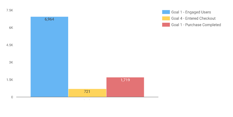
This formula aggregates each goal of each device category in the same bucket ( ‘.*’ is our wild card here). When applying this new calculated field as a dimension, we finally get the expected results:
[caption id=“attachment_576” align=“alignnone” width=“800”] Bar chart goals for all device category[/caption]
Does this article help you to solve an issue? If yes please share your experience in the comment section. If you need help with Google Data Studio, Don’t hesitate to reach me directly with your question.